
Bubbles Is
In Trouble
Bubbles Is
In Trouble
Bubbles Is
In Trouble
Bubbles’s in trouble is a short simulation game created with the purpose of exploring meaningful feedback and interactions in a narrative. I wanted to ensure that the interactions I created in this simulation were not only satisfying visually and audibly, but also intuitive.
Bubbles’s in trouble is a short simulation game created with the purpose of exploring meaningful feedback and interactions in a narrative. I wanted to ensure that the interactions I created in this simulation were not only satisfying visually and audibly, but also intuitive.
Bubbles’s in trouble is a short simulation game created with the purpose of exploring meaningful feedback and interactions in a narrative. I wanted to ensure that the interactions I created in this simulation were not only satisfying visually and audibly, but also intuitive.
Role
UX Researcher
UX Designer
Programmer
Illustrator
UX Researcher
UX Designer
Programmer
Illustrator
Timeline
5 Week Project
5 Week Project
Skills
User Interviews
Java Programming
Illustration
User Flows
User Interviews
Java Programming
Illustration
User Flows
Tools
Figma
Eclipse
Procreate
Figma
Eclipse
Procreate
Team
Solo Project
Solo Project
PROJECT OVERVIEW
Bubbles’s in trouble is a short simulation game created with the purpose of exploring meaningful feedback and interactions in a narrative. I wanted to ensure that the interactions I created in this simulation were not only satisfying visually and audibly, but also intuitive.
The main problem was trying to guide a user through a game to hit certain interaction points without solely relying on text instructions.
The solution I discovered was using proximity based pop-ups for interfaces, inventories, and call to actions in order to guide the user through the game.
01
EXPLORING THE PROBLEM
What do you do with just a mouse and limited text?
When you throw a player into a game, they should be able to navigate it easily without relying on textual instructions.
Normally in games, the easiest way to tell a player to do something is through verbal cutscenes, or text based instructions. However, although this project has text, I was tasked with creating a game where even if the text was broken, the user could find its way around.
02
HOW DO USERS RESPOND TO INTERACTION
Through interviewing 10 different participants I created a user study that centred around different interaction methods in the context of games.

Click Versus Click and Drag
Users overwhelmingly preferred to just click, indicating that the process of clicking and dragging simply delayed the process and made it trickier than it needed to be.
Click and Hold Versus Space Bar
Users indicated that they prefer clicking and holding since the action before to pick up the jug was clicking so it was natural. Switching to space bar broke up the flow of the action.


Click and Hover Versus Double Click
Although the hover was seemingly easier, users expressed that if this interaction was scaled up to multiple different options of boxes accidents might happen. They could hover over the wrong box causing the wrong ball to be picked up.
Take-Aways From the User Study
Users prefer when the interaction is seamless and easy, as opposed to simulating reality perfectly.
Mouse interactions are great, however moving your hand from the track pad on a laptop up to the keyboard after a while can be seen as an inconvenience.
Interactions should be created with ease of use in mind, and not have situations where the user can accidentally performa an action they didn’t want.
03
IDEATING THE SOLUTION
What we need to keep in mind and address in our solution:
Simple Interactions
Clearly Directing the User
Not Overwhelming the User
Through this we are able to hopefully create a game that doesn’t require too much mental energy to play and navigate through.
Initial Solution
I thought that having UI on the screen that would indicate to the user what things they can press would be a simple way of solving the problem. As visible in the mock-ups below.

However I soon realized that this wouldn’t work because it clearly overwhelms the user. It also takes away some of the suspense of the game. When all the choices are automatically thrown at you, not only is it overwhelming but you have almost nothing left to discover.
I then realized:
When you are playing a game, most of the time you tend to walk around the environment to find whats around you.
This then left me to the next solution...
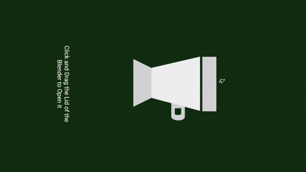
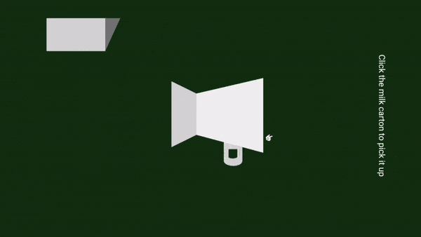
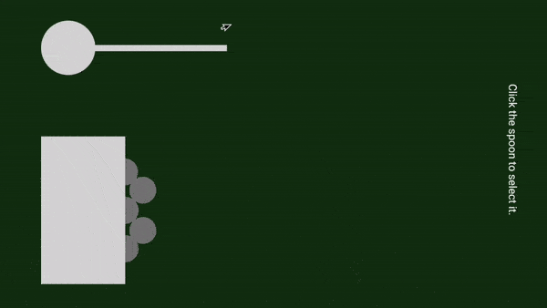
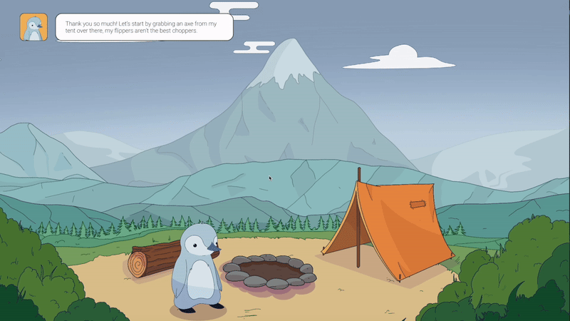
UI Proximity Pop Ups
Through this solution, as the user encounters something in their environment that has a purpose or a potential to be interacted with, an interaction will appear near it indicating what they can do. Not only does this not overwhelm the user, but it keeps a sense of suspense to help them stay engaged.
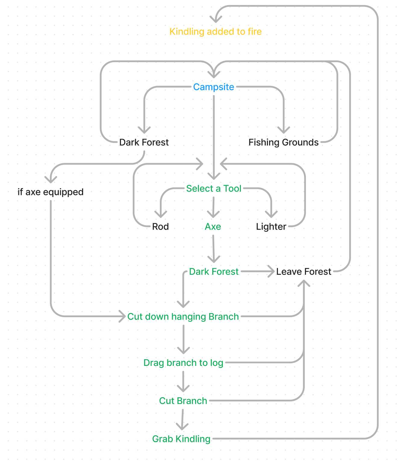
Outlining the flow and where interactions need to be
Interactions need to be placed along the green path in each of these flows in order to ensure that user is following along the narrative properly and leading towards the correct ending!


Low Fidelity Wireframes

High Fidelity Wireframe


Integrating the Solution
04
FINAL SOLUTION
05
PROJECT REFLECTION
What did I learn?
When you’re guiding a player through a game, you don’t need to drag them through it like a child, you just need to watch them from a far, making sure they’re on the right path!
One thing I really loved about this project was the way I was able to create a cohesive experience that played to all of our multimedia senses. Not only was it visual, but it also had a lot of carefully planned out sound effects.
In the future, one way to improve this would be to include more user interviews. For example, after implementing the UI features I could have gone back to the original interviewees to gather additional feedback on how to change them. However, I was unfortunately limited by time on this project.
Alright, thank you :)
THE REST OF THIS CASE STUDY IS NOT VISIBLE ON YOUR CURRENT WINDOW SIZE. PLEASE INCREASE THE WINDOW SIZE, OR MOVE TO DESKTOP OR TABLET.