PROJECT OVERVIEW
Recently the Vancouver based car sharing company revised their gas refund policy. If a rider chooses to refuel their EVO mid trip, they now have the option of receiving a full refund, or a 115% driving credit on the paid amount.
However, the experience of requesting a refund is more complicated than it needs to be making it frequently un-used.
Re-organizing the information architecture in the mobile application and including a easy to use form making refund requesting simpler opens further revenue for the company and more client satisfaction.
As the UX researcher and designer for this project I explored competitors, conducting user interviews, anaylzed business and user interests and developed a design solution.
01
EXPLORING THE PROBLEM
What’s Wrong With the Current Setup?
When a company is trying to make a user base perform an action that benefits themselves more than the user, it should be as easy as possible.
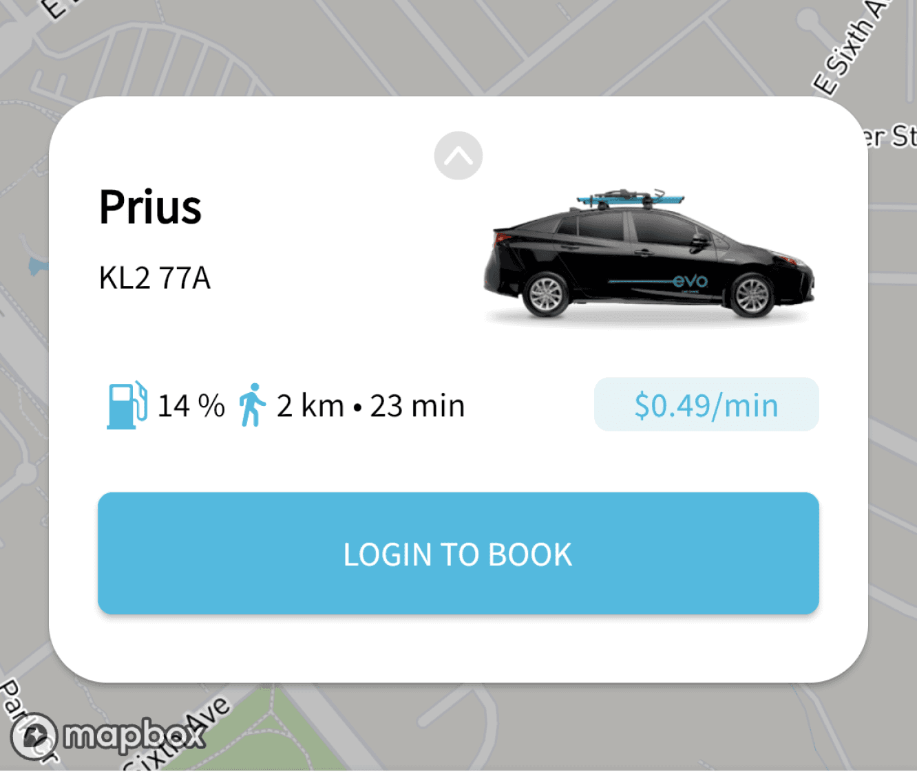
For a rider to receive their refund for refuelling their EVO, they need to (A) take a photo of their receipt, (B) take a photo of their license plate, and (C) email it to info@evo.ca.
EVO is also trying to incentivize more customers to refuel cars through offering the option of receiving 115% driving credit; but they won’t if its not a simple process. Their solution was to simply add “CREDIT” to the email subject.
02
WHAT USERS ARE SAYING
Through interviewing 5 frequent EVO users over Discord call, I was able to gather the following insights on the new policy.
The Good
“I can pay for the gas then I get extra credit points, its basically free!!”
“Now at least I know that if I find a low fuel car I can choose it without worrying”
“Took an EVO to kamloops for 6 days, it was less than $100 dollars and the refund for the gas made it worth it.”
The Bad
“It seems risky to me, what if I type the email in wrong, there’s no confirmation”
“It seems annoying to have to make a new email every single time I want to refuel the car”
“Can’t they just build it into the app I’m handling the rest of my ride features with?”
“I gotta remember, save, or google the email address every time”
It seems like the users absolutely love that they are able to not only request a refund, but also have the option of receiving credit. The problem is they are not fond with how it is set-up. They wish it was a lot simpler, and quick/painless.
03
HOW IS THIS AFFECTING THE BUSINESS
Of course EVO wouldn’t consider fixing this system unless they also have something to gain from it. As a result, I conducted an analysis to understand where EVO might seek to improve their business goals.
The Good
Credit system will lead to more fuelled cars on the road!
Bad refund policy means more people might forget about requesting, meaning no loss in revenue.
Credit system essentially saves money.
The Bad
Refund system inherently gives the company no fiscal gain. However the credit system does.
Labour costs of answering customer service refund claims are high. As well as frustrations from bad UX.
Not a cohesive experience for consumers.
one of the many low fuelled Evo’s near me
However, the biggest takeaway here is this:
If the refund system is more visible and an easy experience, more people will choose the CREDIT option allowing EVO to essentially fuel their vehicles for free. More cars on the road that are fuelled also means more customers.
There are still so many un-fuelled or low fuelled cars on the roads, that users are sometimes completely un-able to find cars for themselves. Through an improved and more visible experience EVO is essentially creating more customers for little or no cost.
04
UNDERSTANDING THE USER

Meet John Kook
The Commuter School Student
John is interested in taking an EVO from his house in New West to SFU on a weekly basis. One of the problems he encountered was that the ones around him tended to be out of fuel often.
Worried that he wouldn’t be able to make it up the hill in time, he was ecstatic to learn about EVO’s refuel policy. After going through the refund process a few times, he finds it to be not only quite annoying, but also quite anxiety inducing.
Now considering the option of buying a car, he finds himself intrigued by the new CREDIT policy.
John’s Current User Journey

From understanding John's journey, its clear that he loves the ability to request a refund, as it allows him to actually use the company’s product. Without it, he wouldn’t be able to because of the lack of fuelled cars, and the barrier to entry to refuel them. However, there are a few pain points associated with this journey that I would like to address.
Pain Points:
Given the frequency at which cars lack fuel, the information surrounding the refund policy is extremely difficult to find.
The user has to switch between several different platforms, between their camera, email, and EVO app, creating frustration.
The lack of instant feedback and confirmation that the request is being processed creates anxiety for the user.
Based on the information regarding the business goals and the user journey gathered from my user interviews I moved on to focusing the problem into a concrete statement. I made sure to keep the user’s pain points in mind,
05
FOCUSING THE PROBLEM
The Goal
How might we redevelop EVO’s refuel and refund request system so that it is simpler, easily accessible and reduces customer anxiety?
06
SURVEYING THE COMPETITION
I then began to examine what other car share companies are implementing to handle gas refunds. I completed a competitive audit between 4 companies occupying the same space as EVO. I tried to examine the purpose behind each of their methods while also analyzing the pros and cons of each.

If all these companies use a gas card, why doesn’t EVO?
Well they actually did. Until, it became too costly since there were a bunch of people who would smash the glass of the cars in order to steal the gas cards. As a result they switched away from this physical solution to a digital one.
Gig car share’s solution is the most compelling. However, the problem is that it is built into a general form full of every single other customer service question.
06
IDEATING THE SOLUTION
What we need to keep in mind and address in our solution:
Simplicity
Accesible
Positive Reinforcement
Security
Incentive
Through this we are able to create a more accessible and easy to use refund submission method while also reducing anxiety through the use of strong positive reinforcement.
After considering a bunch of different ideas, some more possible than others, I narrowed it down to 2 that I presented to my original 5 interviewees to receive feedback on based on the 5 key terms outlined above.
Possible Solutions
Option 1
Instead of a physical gas card, EVO could implement a digital gas card through their app. Similar to apple pay in the way it works.
Option 2
Instead of email, there can be a submission form where the user can attach their photos and send it through there. Built into the EVO application.

Based on the feedback and the options relation to the categories outlined for a solution, I decided to go ahead with option 2. The users also indicated that they want the photo taking process to be built into the app so they don’t have to even switch between different applications.
Fixing the App’s Information Archiecture
Fixing the App’s Information Archiecture
Currently, the home screen for the app is very disorganized. There are a bunch of different menus that share a lot of functionality that we can merge together. In order to properly incorporate our refuel section into the application we have to first clean up those areas.
The Old App
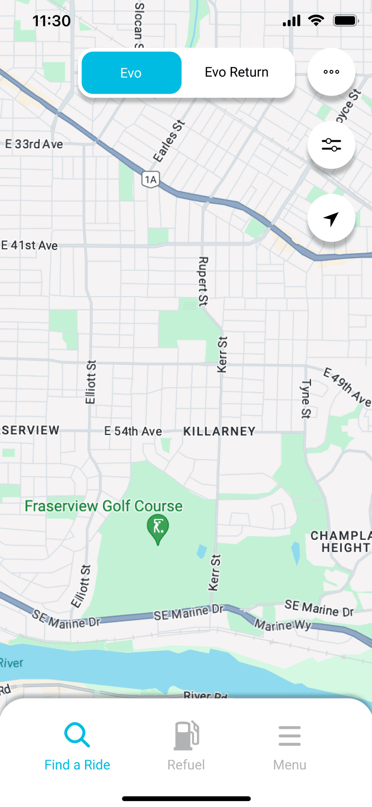
The screen to the left is one I designed based on the current home screen where I simply insert the refuel section into the home bar at the bottom.
The main problem here is that the placement of certain items seem to be random. They don’t have a certain place/point of being where they are. The bottom bar should hold key features outside of the current screen. This would include find a ride, refuel... and vehicle list/QR codes (depending on frequency).
The Redesign
The screen to the right is the updated one. It follows the new information chart as seen below. It groups relevant information together while also making room for the refuel section.

Search filters and resetting map location are helpful, but their position is not very balanced with the rest of the UI. As a result I moved them to a more balanced position.

Wireframes
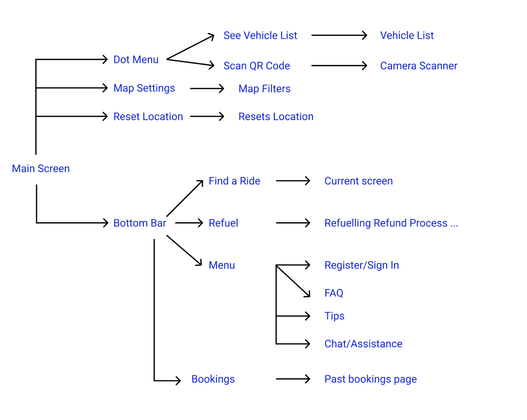
Now that the information architecture of the app is fixed, I moved on to developing wireframes for the actual refuel survey process. I followed the information design for the flow of the refuel process outlined below.
Refund Process Flow

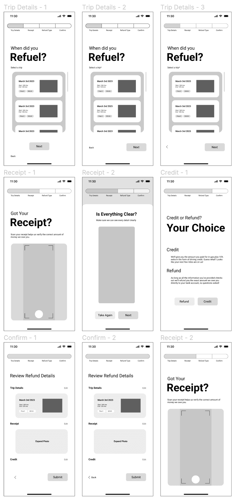
Low Fidelity Wireframes

Mid Fidelity Wireframes
07
REFINING & REFINING
After going through the first round of refinements I presented them back to my original 5 interviewees to see if there are any final changes that needed to be made to the design. There were a few that I ended up making.
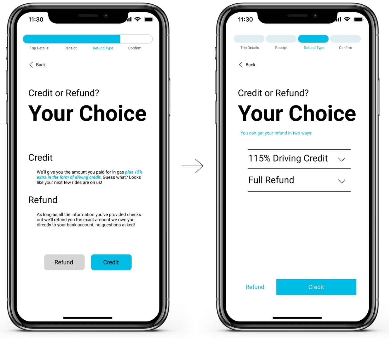
Simplifying the progress bar and buttons and adding calendar search option

Cleaning up the information on the credit or refund page as to not overwhelm them
08
FINAL SOLUTION
09
PROJECT REFLECTION
What did I learn?
To uncover the best solution you can, its important to look at all parts of the story. One of the things I’m really proud of here is how I was able to incorporate both the user and the business’s goals into the final solution.
In the future I would have loved to have the prototype tested with representatives from the EVO company to see if they had any of their own further feedback to add to it. As well as interview them to learn more about their design and company policies.
The work with EVO isn’t done yet. As you could probably tell the rest of the app requires a lot more polish. Their current product in the market is well below the industry standard and could be vastly improved!
Alright, thank you :)


Evo Refuel
Evo Refuel
Evo Refuel
Simplifying and expanding EVO’s mobile application’s refunding process to increase company’s revenues and user satisfaction.
Role
Role
UX Researcher
UX Designer
UX Researcher
UX Designer
Timeline
Timeline
4 Week Project
4 Week Project
Skills
Skills
User Interviews
Interaction Design
Secondary Research
Visual Design
User Interviews
Interaction Design
Secondary Research
Visual Design
Tools
Tools
Figma
Miro
Figma
Miro
Team
Team
Solo Project
Solo Project
THE REST OF THIS CASE STUDY IS NOT VISIBLE ON YOUR CURRENT WINDOW SIZE. PLEASE INCREASE THE WINDOW SIZE, OR MOVE TO DESKTOP OR TABLET.